

The Hidden Shape of Profitability
Surfacing operational improvements overlooked by traditional value creation
Can You Identify This Company?
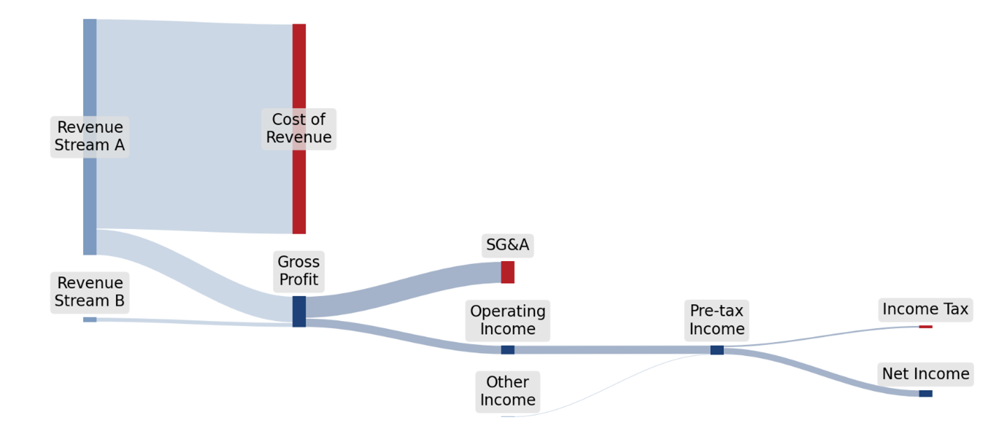
Look at the diagram above. Without seeing a single dollar figure, you can already tell a great deal about this business. The revenue side has two tributaries, a vast one and a tiny one. The large one disappears almost entirely into cost of revenue; the small one, barely visible next to it, flows nearly undiminished all the way to earnings. When the flows converge through operating expense, that small tributary turns out to be responsible for a surprising share of what reaches the bottom line. This is a company that sells things at very thin margins and makes most of its profit somewhere else. The company is Costco. The thin tributary is membership fees.
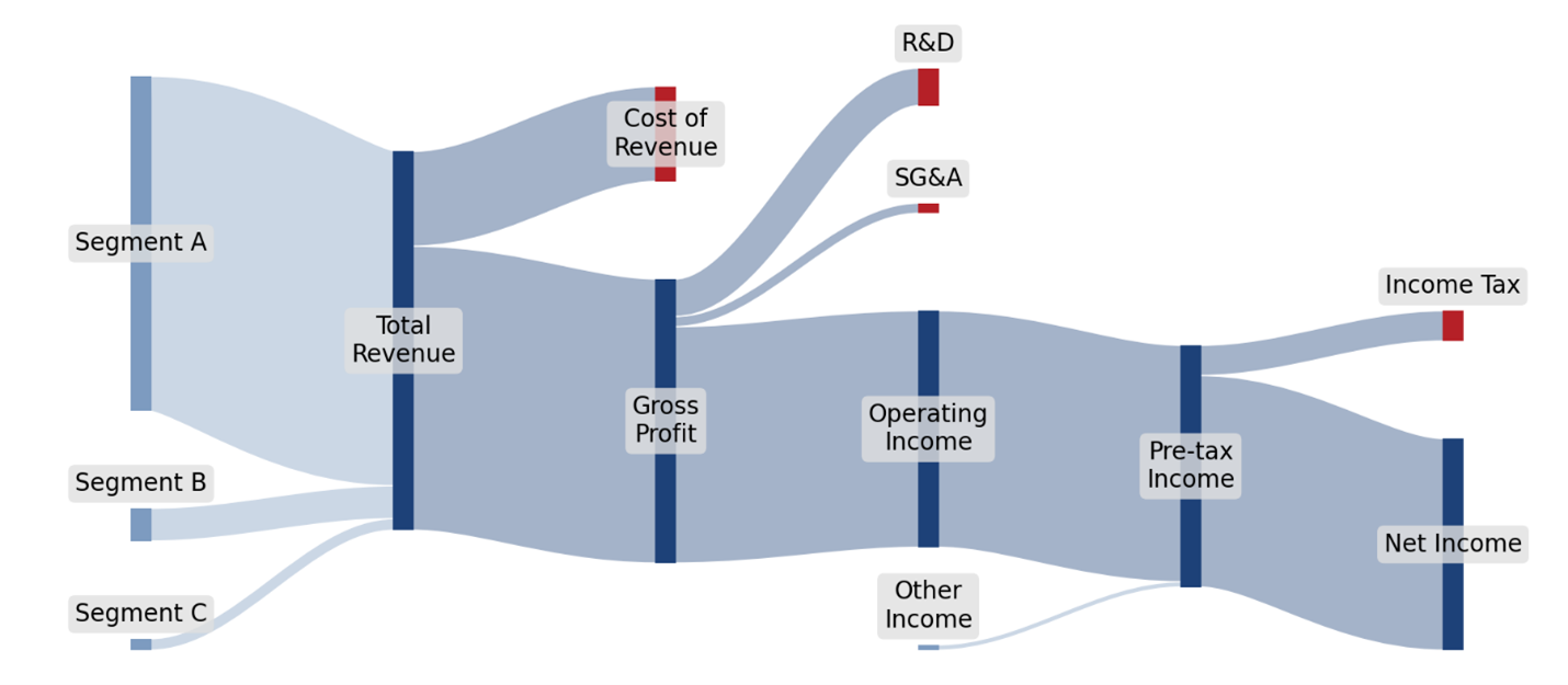
Now look at this one. The shape is inverted relative to the last one. One revenue tributary is enormous, and the others barely register. Cost of revenue is small relative to the top line; the gross profit band is vast. R&D is larger than SG&A. Operating income is wide where, in many businesses, it is narrow. This is the fingerprint of a company whose economics are defined by what it knows rather than what it sells, and whose revenue has concentrated almost entirely into a single market in recent years. The company is NVIDIA. The enormous tributary is the data center business.
Every business has a shape. The shape reflects its model, its history, and the operational choices that accumulated over time to produce it. Most executives have never seen their own company drawn this way. When they do, they tend to see something immediately that no income statement had ever quite revealed: a channel that is smaller than they remembered, a cost line that is larger, a relationship between two numbers that had always lived on different pages of a report.
These are Sankey diagrams, flow visualizations where the width of each band represents its magnitude. They are particularly good at showing how cash moves through a business: revenue enters from the left, costs peel away as the flow moves right, and what remains is net income. But the shape of an income statement is only one shape a business has. The categories in the diagrams above are inherited from accounting convention. They describe what the business reported, not where its leverage lives.
The real value of this kind of visualization emerges when we stop accepting those categories as fixed.
Redefining the Flows
The column definitions in a Sankey are arbitrary. Any flow can be redimensioned along a different operational attribute. Revenue can be split by channel, product, customer segment, or geography. Operating cost can be split by cost center, general ledger category, or any other dimension that lives in the data. The dollars are the same; only the organizing question is different.
Consider Bean Machine, a hypothetical $1B manufacturer of high-end coffee equipment with parallel commercial and consumer lines. The commercial line serves chains, QSR, hotels and foodservice, and independent specialty operators with espresso machines, grinders, brewers, and water systems. The consumer line sells through specialty retail, big-box retail, and direct e-commerce. The company has grown through three acquisitions over the past eight years, leaving it with the operational footprint and integration debt of a business larger than the one its income statement describes. Drawing that income statement as a standard Sankey would produce something familiar and unsurprising. Drawing it with several columns redimensioned around operational reality produces something else entirely.
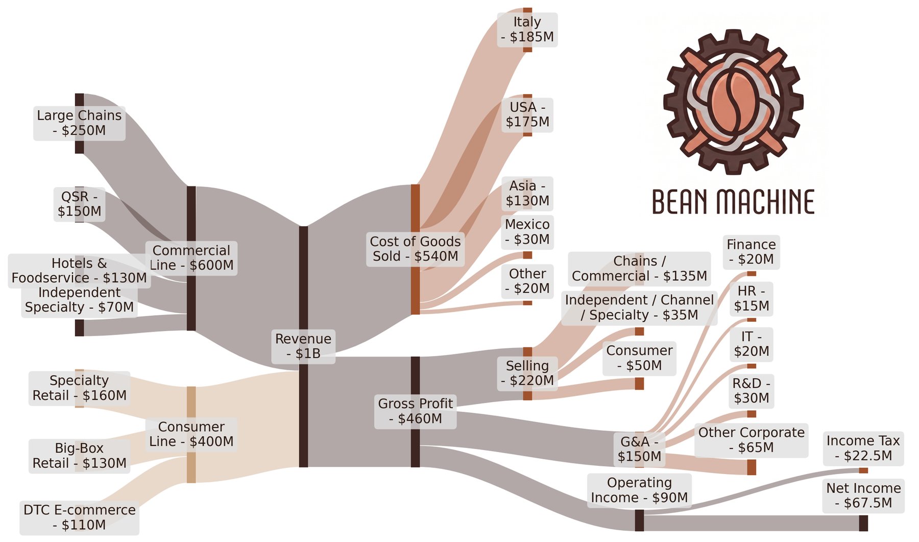
This shows the $1B of revenue, the $540M of cost of goods sold, the $90M of operating income that an income statement might show. But the shape tells a different story. The revenue side is visibly two different businesses: a commercial line dominated by chain accounts, and a consumer line spread across three channels of comparable scale. Cost of goods sold, organized by country of origin, shows that the company’s manufacturing footprint is genuinely global, with Italy and the United States together producing roughly two-thirds of cost and the remaining third spread across Asia, Mexico, and a long tail of specialty origins. Selling expense, organized by which kind of customer it serves, shows a heavy concentration in the chain and commercial segments. G&A, organized by sub-function, exposes a substantial “other corporate” band that begs for further attention. None of this required new data. It required only asking the data a different set of questions.
Choosing which flows to interrogate, and which dimensions to use, is where the business itself drives the analysis. Sometimes a management team arrives with specific questions that dictate the dimensioning: a board conversation about channel margin, a PE sponsor’s question about vendor exposure, a CFO’s concern about labor costs. Sometimes the direction comes from the people closest to the work: a sales lead with a theory about a declining account, an operations manager who can feel the inefficiency in a process but has never been able to prove it. In every case, the diagram does not do the interpretation itself. It surfaces the patterns that make the right conversations possible.
Looking Inside a Flow
Extending the Sankey is an interesting tactic, but it cannot tell us, on its own, what sits inside any one flow. For that, we look within the flows, to the records that compose them: invoices, purchase orders, transactions, payroll entries, journal lines. Each record carries dimensional attributes the Sankey cannot simultaneously display, a customer, a vendor, a SKU, a time, a location. Sorting or grouping those records by the right dimension is what turns a flow into something we can act on.
Many of these views take a familiar shape: a Pareto distribution, where a small number of records represent a large share of the flow’s value and a “long-tail” accounts for the rest. What that pattern often indicates is the presence of operational leverage. The head of the distribution, a small number of entities carrying disproportionate weight, is often where strategic actions payoff: renegotiate, reinforce, or protect. The tail is usually where discipline is missing: small accounts underpriced for their service cost, redundant vendor relationships, underutilized SKUs quietly eroding margin. Either end can reward attention. Both are invisible until examined.
A Flow, Examined
Of the sub-flows the extended diagram exposed, the most revealing is “Selling.” Looking inside that flow, sorted by third-party logistics carrier, produces a chart that already tells a story.
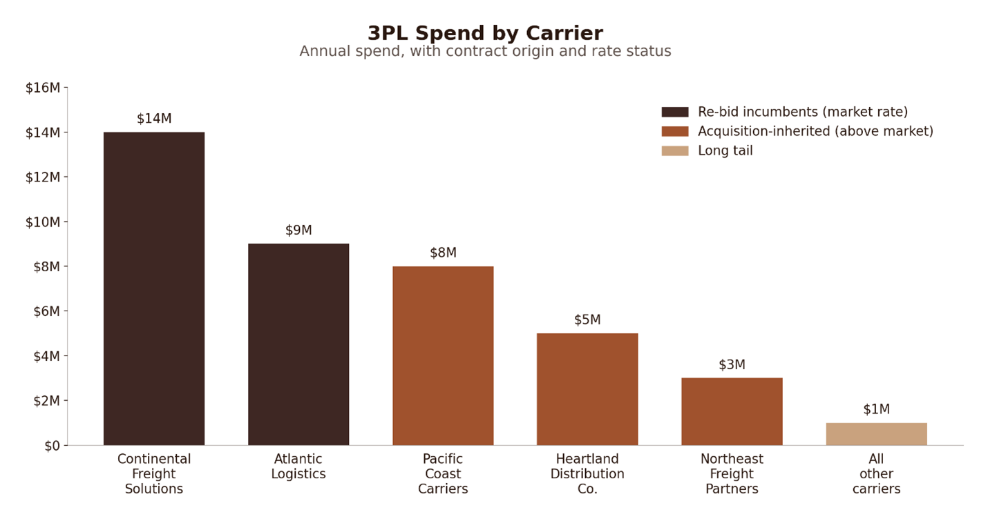
Two carriers occupy the expected top positions: the original Bean Machine incumbents, both re-bid two years ago at market rate. But the next three positions are all carriers inherited through acquisition, none of which has been re-bid since the deal closed. Each of the inherited carriers is costing somewhere between nine and twelve percent above current market for equivalent lane density. The pattern is not subtle. The post-acquisition integration roadmap had prioritized commercial integration, which is to say sales force, channel relationships, and product roadmaps, while logistics had been left in place under the assumption that it would be picked up later. Five years on, later had not yet arrived. The cross-section makes the imbalance plain, and points directly at the lever: re-bid the inherited contracts, consolidate to the two or three best-priced carriers, and recover the margin that has been quietly stifling earnings.
What any given pattern means, whether a concentration is healthy or costly, a gap an opportunity or a trap, is rarely answerable from a chart alone. Clarity and context come from the people closest to the work: operators, managers, specialists who have internalized the reasons the numbers look the way they do. Data alone does not replace that knowledge; it makes the knowledge easier to apply. If you ask a supply chain leader how to improve logistics performance, he or she usually has a limited answer, often, one framed as a request for capital investment or a new system. The same lead shown the carrier-level rate and lane data side-by-side, with the post-acquisition contracts highlighted against the negotiated incumbents, has a great deal to say: which carrier serves which region best, which lanes the inherited carriers handle that the negotiated incumbents do not, which operational dependencies make consolidation harder than the chart suggests, and which service-level commitments need to be renegotiated alongside rates. That context is rarely in a typical operations report. That conversation is where the diagnostic work of the diagram meets the operating knowledge of the business, and where reliable, actionable improvements are found.
Small Changes, Large Consequences
Earnings improvement work often assumes meaningful results require dramatic moves: restructure a division, renegotiate a flagship contract, exit a market. Each can be the right answer in the right situation, but they are high-risk, uncertain, slow, and disruptive. The operational cross-section approach exposes a different path. Each view surfaces specific, data-supported conversations about the business and its opportunities to improve. Individually, any one is modest. Together, they compound into something meaningful.
The Bean Machine 3PL Pareto above is one of several views (and eventually, initiatives) we might discuss in the course of a project. The four improvements that follow are representative sample of what this approach surfaces, drawn from two flows in the financials and a handful of cross-sections beneath them. They are far from exhaustive. A typical engagement at this scale produces dozens of findings of comparable character; the four here are highlighted because they are simple, relatable, and concrete enough to describe in a paragraph each.
- $2.0M from 3PL consolidation. The 3PL spend Pareto, examined above, exposed three acquisition-inherited carriers running at nine to twelve percent above market on equivalent lane density. Treatment: consolidate to the two negotiated incumbents and re-bid the inherited contracts against current combined volume.
- $1.1M from shared services consolidation. G&A sorted by acquired entity revealed that each of the three acquired companies retained its own controller, customer service, and AP team for years post-close. Treatment: consolidate the duplicated back-office functions into a single shared services structure.
- $1.0M from marketing services consolidation. Selling cost sorted by agency relationship surfaced seven marketing agencies across the three legacy companies, each chosen to support a specific brand voice that has since been unified under the Bean Machine identity. Treatment: consolidate to two creative agencies and one media buyer, renegotiated against combined spend.
- $800K from AP automation through RPA (Robotic Process Automation) and EDI (Electronic Data Interchange). Invoice processing time sorted by source channel showed manually re-keyed invoices taking forty-five minutes against two minutes for EDI-direct invoices. Treatment: implement RPA bots for the manual flow, integrate EDI feeds with the top eight customers, and adjust payment timing to current contract terms.
Together these four improvements produce $4.9M of annualized EBITDA improvement on a $90M operating income base, a 5.4% lift in net income after tax, from a small sampling of changes that are individually unexceptional. Each is specific, implementable, and supported by the evidence the cross-section produced. None require a strategic pivot.
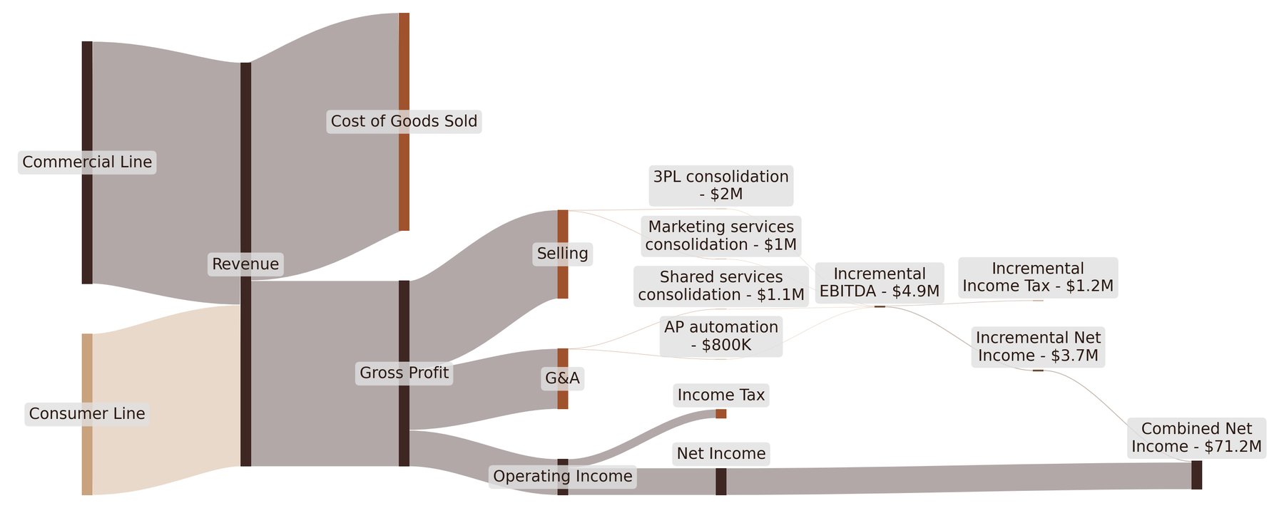
The extended diagram showed a business producing $67.5M of net income. The same diagram with the four incremental flows added arrives at combined earnings of approximately $71.2M. Each incremental flow looks minor, like a tiny thread, relative to the volume of the business. Combined, they move the bottom line by a margin worth pursuing in its own right, and they are four findings out of dozens.
The takeaway is not that small changes are easy. It is that the problems surfaced by this kind of examination are, by nature, the right size for real action. Specific enough to scope. Small enough to implement without organizational upheaval. Concrete enough to validate with the people who will do the work. Simple enough to implement in parallel with the rest. The compounding happens because these conditions together produce a reliable rate of realization across a portfolio of opportunities, faster and more cheaply than the dramatic interventions they replace.
A Note on the Foundation
Everything described above depends on one unglamorous prerequisite: the data has to be reasonably clean.
Enterprise systems that have survived migrations or absorbed acquired companies tend to contain years of accumulated inconsistency. General ledger categories drift. Cost centers multiply past their usefulness. Vendor records pile up under slightly different spellings. This kind of hygiene work is real, non-trivial, and often unglamorous in its own right.
Anyone who has filled out an expense report in a system with 200 categories understands the practical end of this. Nobody spends ten minutes hunting for the right classification on a $12 lunch. Everyone eventually settles on “Office Supplies-Other-MISC” or whatever its local equivalent is, and the problem compounds across thousands of such small decisions over the years. It is not a rounding error in the data; it is the data.
One useful framing is that the Sankey is itself a diagnostic for data quality. An unexpectedly large “uncategorized” or “other” node is a finding, not a failure. It points precisely at where data hygiene needs attention, and it gives a way to describe that need in strategic terms that stakeholders outside of IT or finance will recognize.
Seeing Clearly
The tools in this paper are unremarkable on their own. Flow diagrams have existed for over a century. Pareto analysis is a standard operational technique. What earns their place is how they are used together, as the “data-half” of a validation loop along with the people closest to the work. When high-resolution data and grounded operational context come together, they paint a rich and textured portrait of the business and how it can be improved.
The payoff for operators willing to do the work is a set of changes that would be invisible in a conventional analysis: specific, actionable, reliable in the way they stack into earnings growth, and difficult to match through more dramatic means. The payoff for boards and investors is a framework for rapid, reliable value creation.
The earnings growth opportunities available to most businesses are not waiting on some strategic breakthrough. They are in the data and often already known by the people closest to the work. Unlocking them is a matter of asking the right questions of each.
Let’s talk. If any of this sparked your interest, we’d love to hear from you. Whether you’re curious about what Vici can do for your business or want to dive deeper into our approach, now’s the perfect time to connect.
Your next batch of earnings growth initiatives is already inside your company.
Let’s unlock it together.
Connect on LinkedIn – Alec – Danny – Adam – Josh